Skip to content
I’m guessing you found the first post useful. Like I said in the previous post the next one would be about Security. Although, I will build-up to actual methods of making your check-out secure, this post will pertain to making your customers feel secure (Visual Security).
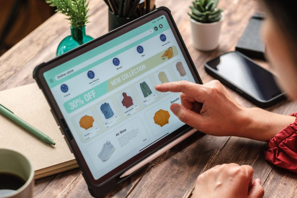
If you’ve had experience in eCommerce before, and at least took a chance on A/B testing your check-out, you would have noticed several things. The specific aspect I’m referring to is making your payment section appear secure with a color differentiation, the part where customers input their payment information. What I’m saying is make it look different from the rest of your check-out screen, make the color of that specific box different and try to add a icon that says security (A Lock, badge, whatever you think will help).
People are visual, so if your check-out looks insecure, even if you have thousands of dollars worth of security behind it won’t matter worth shit if it doesn’t look secure. People will simply leave your site if it looks untrustworthy. So look at how the eCommerce leaders do their check-outs, and use them as a short-cut to learning.